
This write up is an in depth write-up for kindergartens (preschools, and even education centres) where I will go through some basic elements like method and design approach, colour selection, themes and execution methods to achieve them. Kindergartens (also known as kindies) are main adopters of murals.
Disclaimer: All images and examples of other kindergartens are just for explanatory purposes and does not indicate any defamation intentions. All names have been omitted.
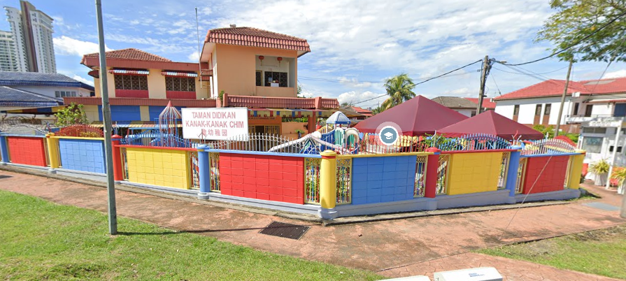
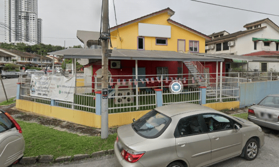
How kindergarten normally paint their building
A typical kindie will have their exteriors painted in colours and cute depictions of objects and animals. It has become a culture for kindies to leverage their environment to standout so they will be more appealing for parents and toddlers/children. In my experience working with kindergarten, there are 2 types of schools: One that is still much conservative and the other adapting to more current trends, digital age, and lifestyle. This approach alone will define the journey of kindergarten murals and paintings.
Life was more simple back then. A home can consist of only a single colour (Fully white or beige). Contractors and workers only painted all walls without much thoughts and people didn’t really bother much. Nowadays, you may set foot into the nearest IKEA and you will notice colours are more sophisticated than ever before. People are now more exposed to alluring interior design concepts and pictures on social media. Our standards of living have evolved and changed from 20 years ago.
However, some kindies (as a business ) has remained unchanged over the years. Clients have projected their values and vision upon the exterior and interior design of their kindie without thinking through their branding strategy. Many kindies suffer from poor understanding of branding. A brand in a company, product or services is simply a promise made to the customers/users. A lot of kindie’s lack of understanding is displayed in some of the poor painting decisions made below.
Common mistakes to avoid
One of the main mistakes made is over usage of corporate colours. KFC and Subway Sandwich chains all have a strong corporate colour embedded into every corner of their restaurants. It gives their customers a standardisation of their business. However, what works for KFC and Subway may not work best for environments like kindies.
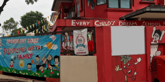
In the above example, red is the corporate colour and they painted on the whole front of the kindie. Studies shown that red is a hungry and agitating colour that will make the child more flustered. It may look professional as a corporate impression but they totally ignored the fact of benefiting their occupants – The children. Having an entire building painted red can be done creatively however it has limited room for expressions and inspiration.

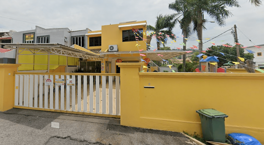
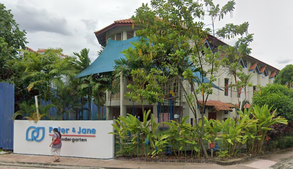
There are also other kindies that may not embody such aggressive colours such as the above, however in an artist’s opinion, this is just lazy painting and there’s nothing inspiring about it.

Your building facade is like the cloths you wear – And like going on a date, what you wear tells a lot about what you have to offer in the long run in a very short time. It also takes a lot of effort to change a first impression of someone, same goes to a business. This is wasted opportunity to deliver more better impressions to leads.


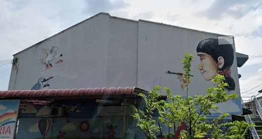
Above are more examples of different kindies who are simply just messy, lost and uninspiring. Colours are like recipes and will only go well with the right combination. Having the wrong colour combinations will make your kindie appear weird and disoriented.

Ironically, kindergarten companies would entrust such complicated design endeavour to the least understood and least conceivable party (the contractors and foreign workers) to carry out painting works. The owner tried to balance out the place by contracting mural artists to paint the brick wall fence in various colours however, it is already too late. The pink and mural simply looks really strange.
As a summary, do not over use corporate colours in your paintings. Do not paint your building in only several major colours. Being colourful will only look good with the right combination.
Approach to design
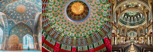
Throughout history religious prophets understood very well that an environment with good design influences a person of how much they will adhere to their teachings while in their environment. A Good design is essential for environmental cultivation.
Artist commonly lack such understanding as well and tend to only focus on painting beautiful art on an oversized canvas without understanding the fundamentals of psychology and business. The purpose of art is to convey messages. It acts as a trigger to those who is presented upon it. It is essential to treat design (in our case murals) as a function or solution to a problem.
A good design is always simple, easy to use and it solves a problem in a reliable way. Murals should also have a fundamental reasoning for it to exist.
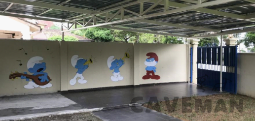
In an above example, teachers are required to line up students before they leave the kindie. Therefore the function of a smurf mural is to help facilitate the students to get into a straight line. Smurfs are also seen to be celebrating the arrival of the children going to kindergarten everyday so they will feel less intimidated and welcoming

Clients should treat mural paintings as a value adding function for example to facilitate a flow, set a right mindset in the right environment, and enhancing moods and experience due to the circumstance. Everything that is not adding value, is a waste.
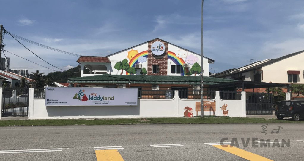
Case Study: Mykiddyland
I would like to take my latest completed project of my client Mykiddyland as a case study. Mykiddyland has one of the most impressive SOPs that is designed to keep up with current times and its something I rarely see among my clients. Having a vision and and clear thought of what a modern kindie would look like would help convey their core values and identity through art and design.
Most clients are simply looking for empty spaces that can be painted on, or how can we simply add colours on walls. Instead you should start with asking ourselves some fundamental questions like “how would my environment benefit the state and learning capabilities of my children”, “How do I make my environment less intimidating and feel safe for the children.” or “What can I do to make my school more appealing to children so they would look forward to going to school?”. These questions are essential to build the perfect environment. The client also laid out several functions that the design should have in the final artwork.

Using the information given, Caveman was responsible to throw in transformation concepts at the beginning of the design phase just to capture a direction of how to refine the art. After several rounds of iteration, the team actually settles down on a direction they would love to proceed with: A forest Cabin theme.
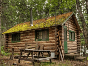
This direction is not over used like all other kindies (Fairy tale, Disney theme etc), the forest cabin theme embraced all their vision of harmony, peace and delight perfectly. Their building also happens to have the perfect setup to take the shape and foam of a forest tree log wooden cabin.
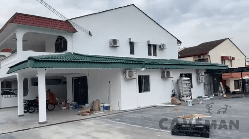
The next step is to take site measurements of the building on site. Using 3D software, a mockup of the building is then modeled out.
A blank canvas for us to design, tweak and optimise

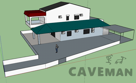
Everything here has essentially capture the most important aspect in design as well: Is it coherent. Skins of wooden logs, brick walls and trees are added in. The trees are now the backdrop of the cabin. Beyond the cabin is a flaring rainbow couple with the sky of clouds and the sun. Once the mock up is completed, it’ll allows us to check for errors, anticipate arising issues and most importantly, get a closer feel to the final artwork without designing in the dark.
Because we are able to navigate our cameras in different angels, we have avoided several potential issues and enhanced what seems to be working. After some hours of refining and feedback through and forth, the final mock up design has been completed and accepted: An exciting mini themed world that the teachers and toddlers can be delighted to be in.
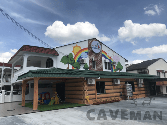
We won’t need to go through the details of execution, but this is how the kindergarten looks like by the end of the day.

The finished painting results of Mykiddyland – A clean, simple and harmonious kindergarten. After we got involved.


A realistic painted wood welcome sign is placed in the entranced. This is to give parents and children a warm welcome everyday. A personalise quote has been added to the wooden signboard which signs the commitment of the kindergarten to their community and parents.

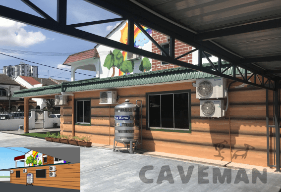
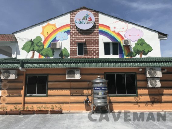
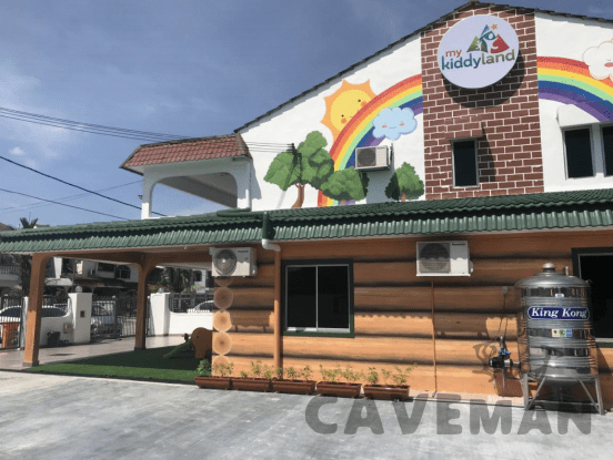
Forest Cabin as inspired from mountain wood cabins. Notice how the building walls is rounded through toning to give the illusion of rounded logs harvested from forested trees.

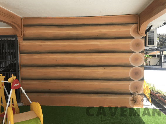
This is actually a flat wall. Illusion made it as though the wall has been stacked by rows of tree logs. Each log also have it’s wrinkles, hairlines, and uneven smooth wooden texture reflecting light. Notice how we do not just slap any mainstream cartoon character on it and call it a day.
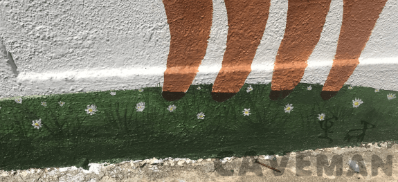
All animals retained a cartoonish look but also has been shaded to give a 3D impression. We do not need to employ complicated colourful artworks all meshed into one. All we need is just simple, carefree and true to the function of each artwork. In our case, to allow animals to be seen by the toddlers and have them accompanying the children while they play around.

Conclusion
If there’s one thing you can to take away, its this: Do not just paint your kindergarten just to look like a kindergarten. Do not do it blindly. Learn to treat the painting like how you are trying to solve a problem instead of just thinking it looks good. Mock ups are great when it comes to minimising errors which should be mandatory in design phase. By the end of the day, the paintings and artworks will influence the growth of the child or toddler in the kindergarten and they will grow up with it. Therefore, we should priorities the effects for the child above all. We have personally receive a lot of praise from residents in the neighbourhood nearby. Walk-ins have also increased for the kindergarten with parents loving the theme of the environment. We are proud to impact the community around the kindergarten and make a difference in the lives of the children.
Thank you for reading it till this far. If you would have an idea of doing a makeover of your kindergarten, do reach out to us as we don’t mind discussing the project with you. We hope that besides having to paint beautiful paintings of murals, we look forward more towards making a difference in the lives and environment using our art.
You may contact me personally at 0166850069
or mail me at kumpenghan@gmail.com
Han
The Caveman Team
